

Urbanistika
UI/UX Designer, Branding, Research, Typography, Mobile Design
Project Time Frame: 4 Weeks
“Urbaniastika is a construction company based in Bogotá, Colombia. The company specializes in constructing apartment communities across Colombia, Costa Rica and Mexico.”
Urbanistika is a construction company based in Bogotá, Colombia. They mainly specialize in building apartment communities, and retail spaces. With properties all over Latin America, Urbanistika needs a website to showcase the properties in order for prospectives buyers to be able to scope the communities available to them.

Problem Statement
The current Urbanistika website suffers from poor design, inconsistent elements, and a subpar user interface (UI) and user experience (UX). Key issues include inconsistent colors, fonts, layouts, confusing navigation, poorly designed forms, and unidentifiable buttons and links. Users face slow loading times, poor mobile responsiveness, disorganized content, broken links, and poor SEO practices. The redesign aims to enhance visual consistency, improve UI with clear navigation and user-friendly forms, and optimize UX with faster loading times, responsive design, and logical content organization. Fixing technical issues like broken links and improving SEO will boost discoverability.

Project Overview
Project Summary:
Urbanistika’s website redesign aims to address poor design, inconsistent elements, and subpar user experience. The project will focus on creating a visually consistent site with coherent colors, fonts, and layouts, and improving the user interface with clear navigation and user-friendly forms. Optimizing the user experience includes faster loading times, responsive design, and organized content. Technical issues like broken links and poor SEO practices will be fixed to enhance discoverability.
Project Description:
The aim of the project is to do a complete redesign of the Urbanistika website. The redesign will pe done in order to adress poor design choices, inconsistencies and a general subpar user experience. Furthermore, the redesign aimed to enhance the mobile experience that the previous website did not account for.
Enhance Visual Consistency
Improve User Interface
Optimize User Experience
Goals:
Poor and Overwhelming Navigation
Overwhelming Design
Not Responsive
Hard To Find Information
User Problems & User Needs:

Displaying All The Information in a User Friendly Manner
Maintaining The Previous Branding
Making The Design Friendly & Intuative
Challenges:
Middle Class Families
Young Working Professionals
Retail
Target Users:
Research Process
Previous Website:

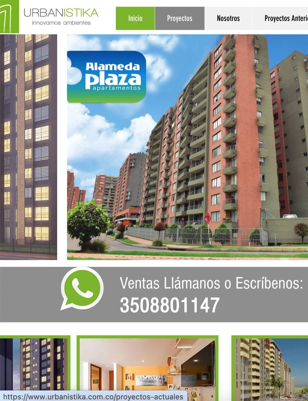
This is an image of the original home page. As it is evident, It is a bit overwhelming with a lot pf elements on display on the first page. The navigation is a bit small. The project names and the three hero buttons on top of the carousel get confusing and overwhelming. The user does not know where to look. There is also an inconsistency in the quality of the images.
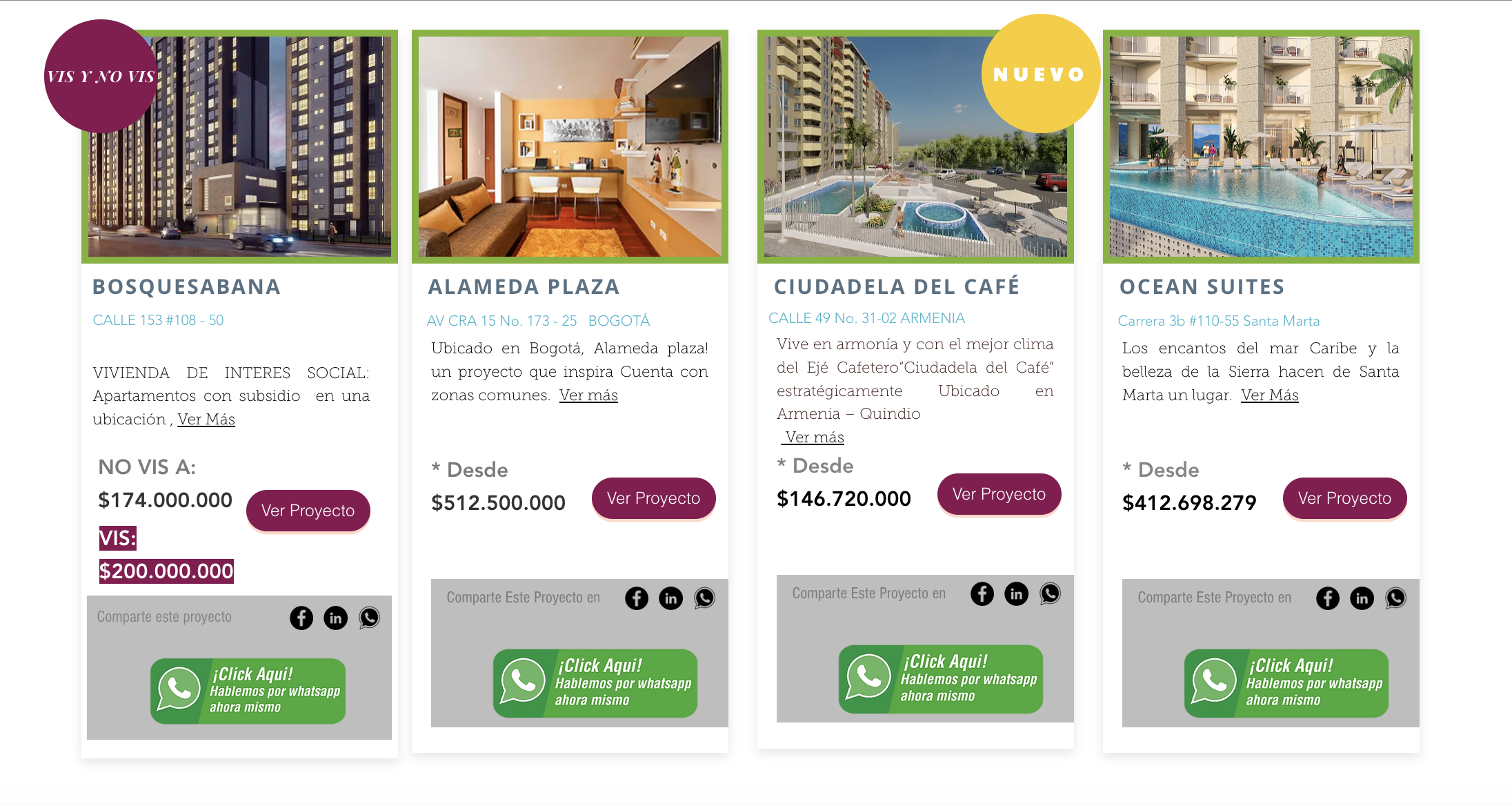
The next part is a group of cards. The size of the cards it’s inconsistent. Some of the cards are longer than the other. Despite all of them containing a view more button, not all of the cards contain the same amount of text. Therefore the spacing between elements is not consistent ant. Some cards also contain elements that the others do not.

This is the page that displays the information about each individual project. As is consistent throughout the website the design is overwhelming. Some of the text is aligned to the center, some of the text is aligned to the right and some to the left. The spaces between elements almost feels random, and this are inconsistencies present in all of the individual project pages.

For the about us page, the story told is very superficial, the elements with in the page also make it overwhelming to look at. The form is also very overwhelming as it not only ask for information but it also contains design elements that distract the user.
The properties that are currently not on sale instead of being displayed in a manner that is easy to read for the user, they are displayed in a list format that is quite long. Furthermore the font size for the list is very small so it makes it hard for the users to read.
The biggest issue however, is the fact that the website is not responsive. When the screen size decreases instead of readjusting for smaller screens, the elements get cropped and the user has to perform horizontal scrolling in order to be able to view the entire content. This is not optimal because it creates a frustrating user experience for user viewing the website on a mobile device.
Design Precedent:
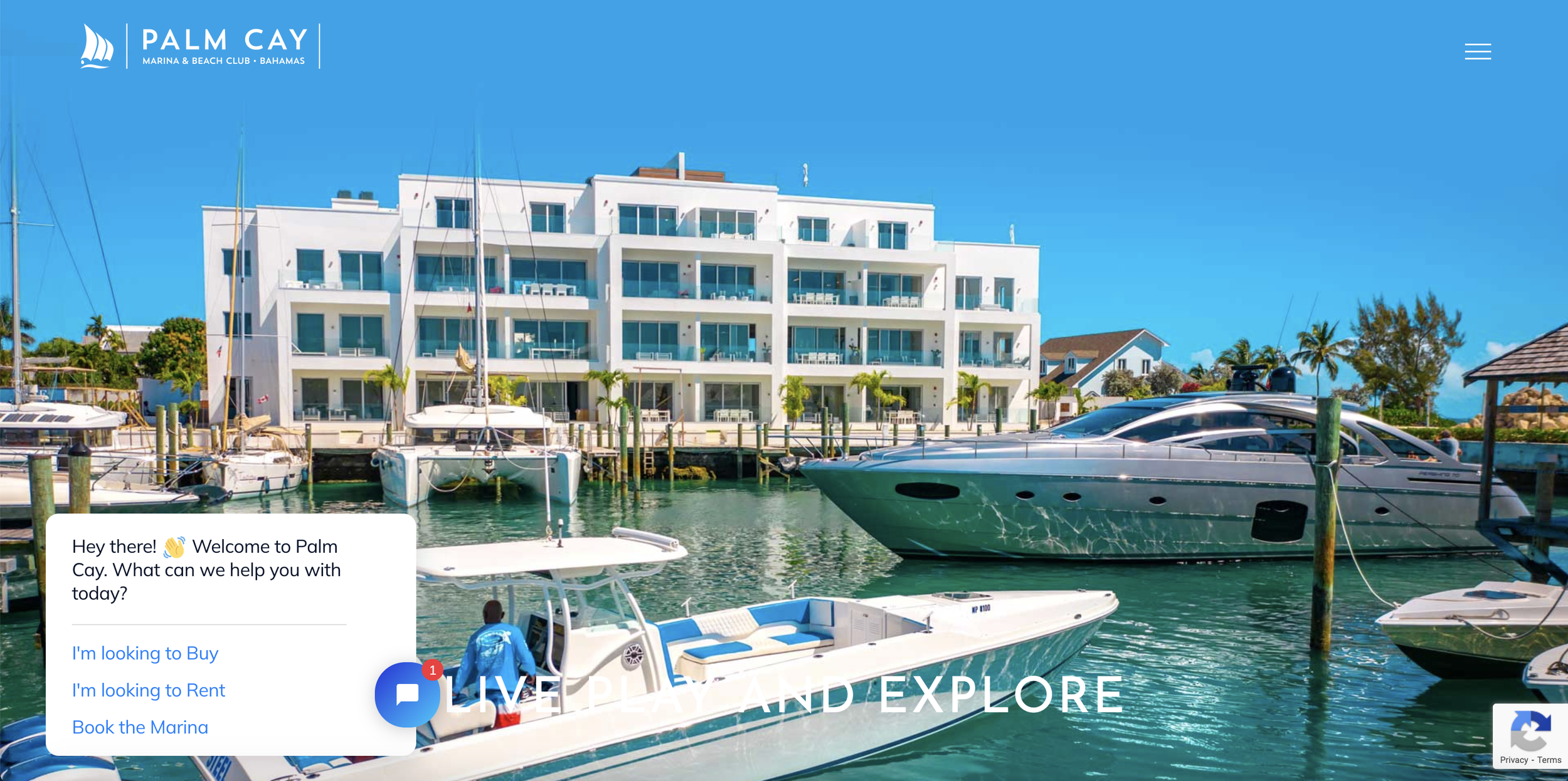
Palm Cay is a website for a property in the Bahamas. This website showcases a clean and aesthetic home page. They showcase a beautiful hero image that displays not only the property but the lifestyle that they are selling with the property. Furthermore, they decided to increase the minimalistic look by making the menu a hamburger menu. They also implemented the use of an AI chatbot that allows the user to chat with a bot before visiting the property and getting information on the property from the comfort of their home.
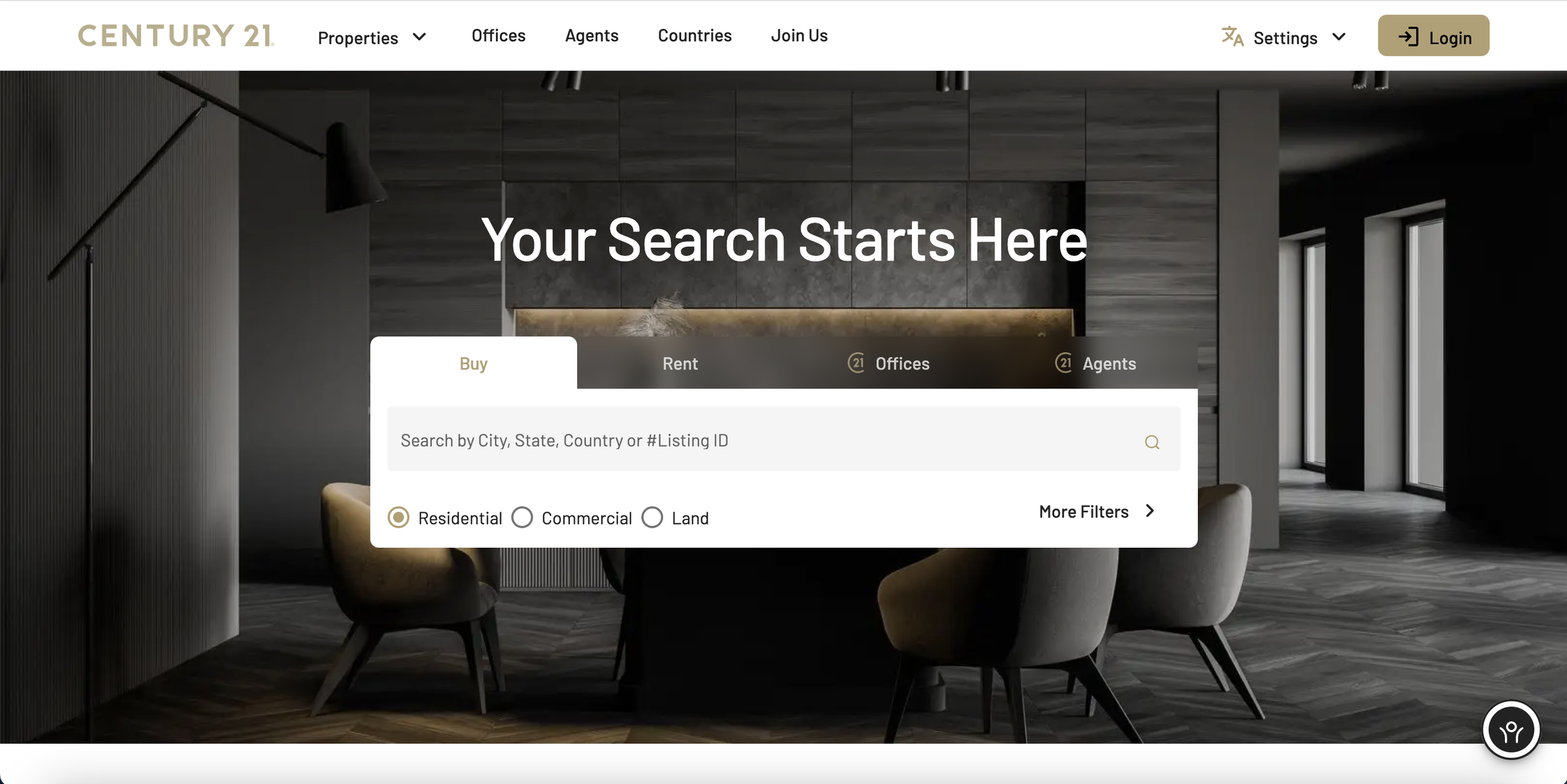
Century21 is a company that offers properties globally. Even though the home page is minimalistic still, they created this aesthetic with their use of colors instead of with the use of less elements. Furthermore, they also implemented a filter in the home page so the user can specify exactly what they are looking for and filtering through all the main options before the web page gives them a list of options that fit the categories the user specified.
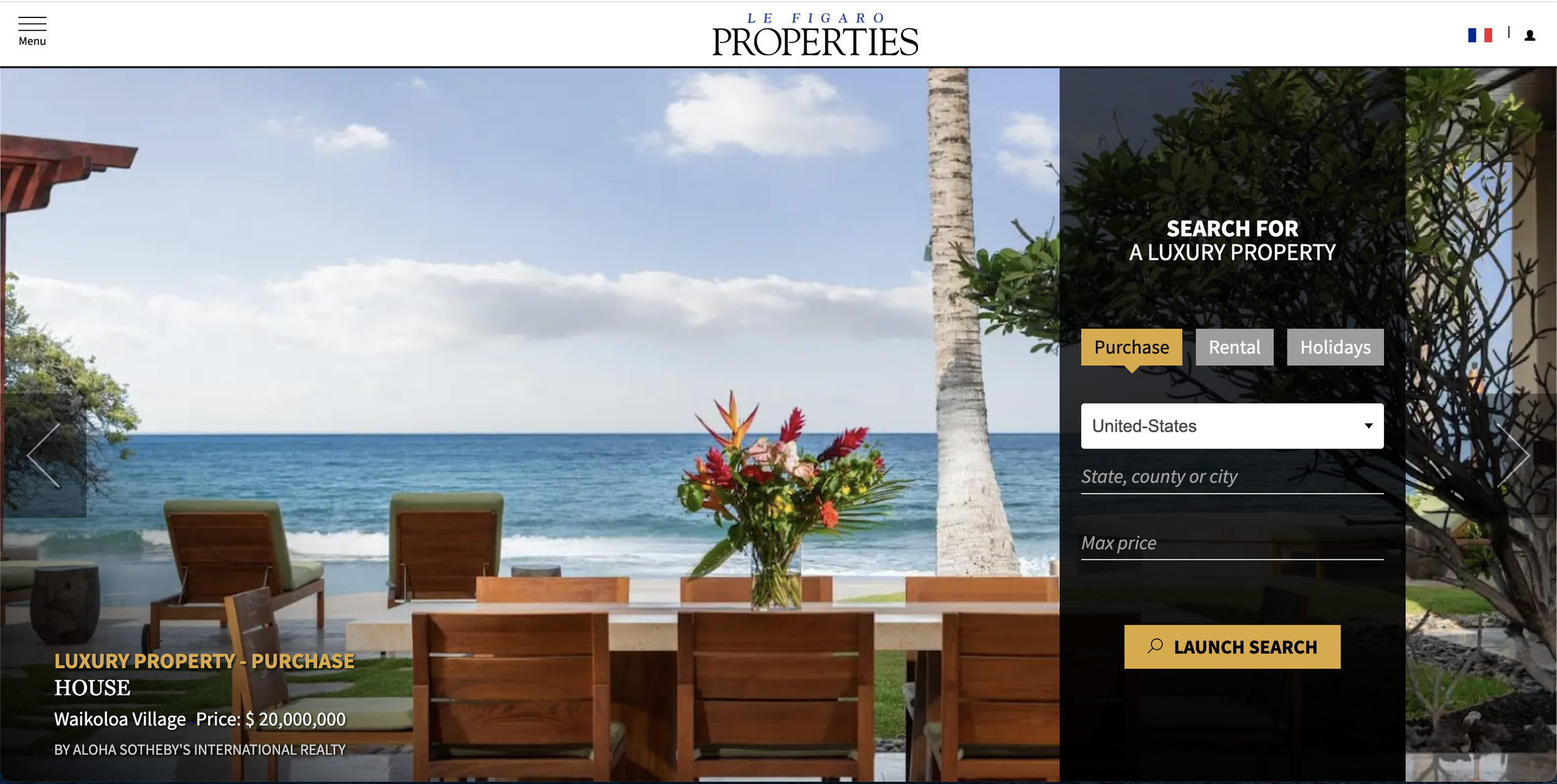
Le Figaro Properties is another website that sells/rents properties globally. Their home page has a more interesting look than the previous two as it mixes the filtering with the hamburger menu in order to not create an overwhelming look for the users. By applying the filtering option at the home page they quickly and efficiently redirect the user to where the user wants to go. Therefore, the minimize the possibility of the user getting frustrated and leaving the webpage before their task is completed.

BOGOAPTS is a website for apartments, and properties in Bogotá, Colombia. They use the monochromatic look to accomplish an aesthetic and minimalistic look. The main picture is a timed carousel that displays the different apartments. Bellow the main hero image there are a set of three cards each belonging to different apartment buildings. The design is consistent, minimalistic and not overwhelming. Furthermore, the website can be browsed in either english or Spanish, which caters to a wider range of users.
User Tasks:
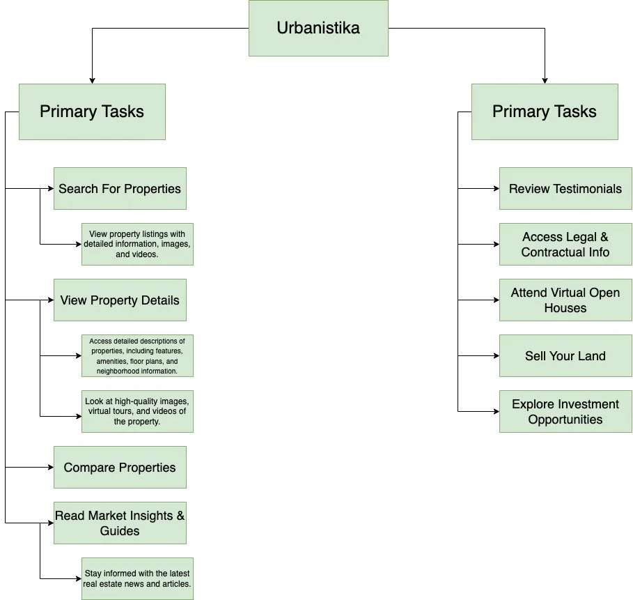
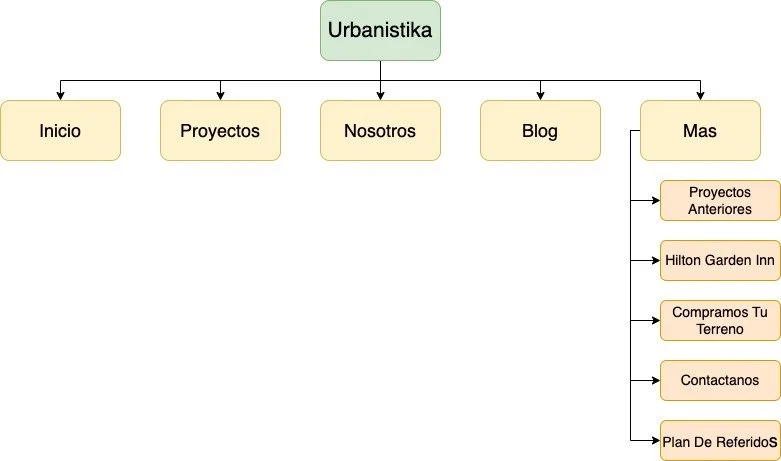
Concept Map:
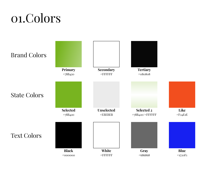
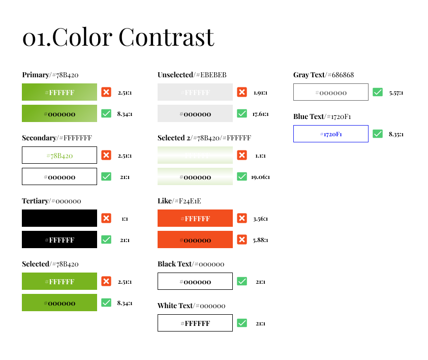
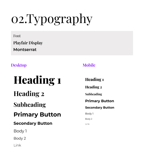
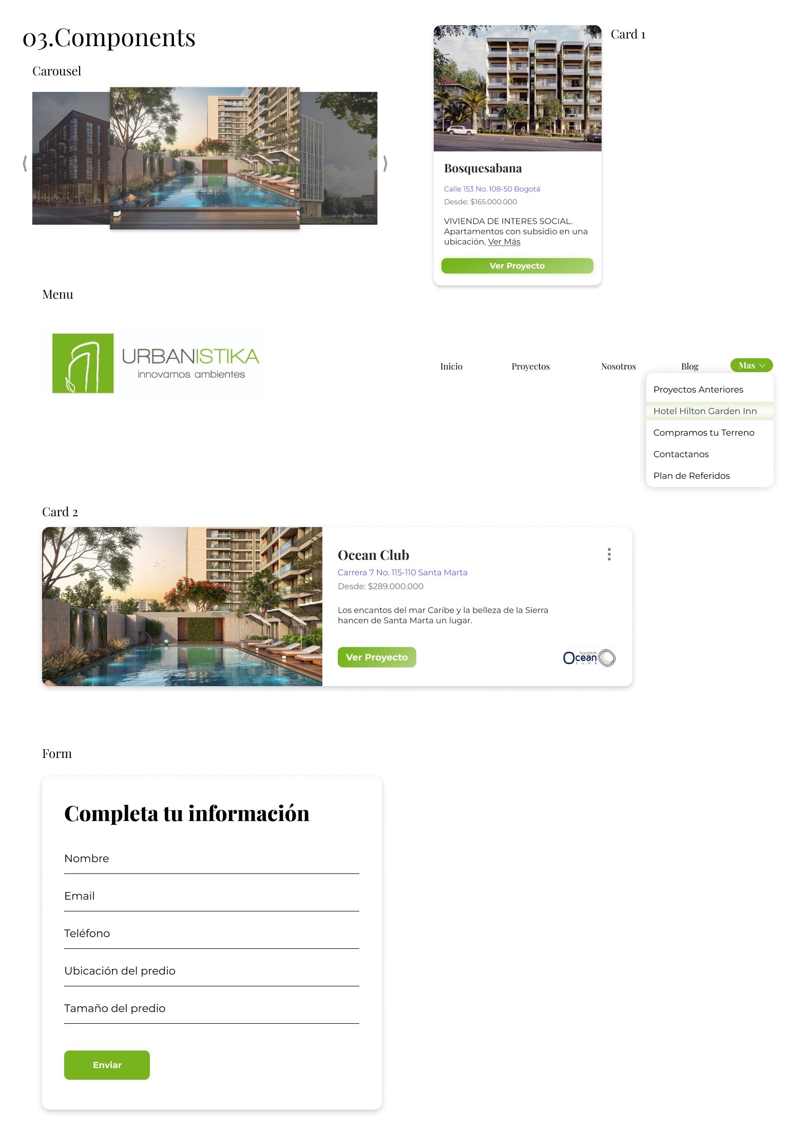
Style Guide
In order for both the prototype to be cohesive and uniform throughout the entire design, I created a detailed style guide, with the colors, the fonts, the components and the iconography to be used throughout the site.

Logo
I did a redesign of the logo to make it more minimalistic and more congruent with the new website. The company wanted to keep their signature green color for brand identity purposes. I used the green as a background and did a very simple sketch of a building with a leaf at the bottom to higlight the company’s commitment to building sustainable communities.

Web Design
This is a video of the final prototype of the redesign I did for the website, showing a lot of the functionality and features that I added.
Mobile Design
This is a video of the final prototype of the redesign I did for the mobile version of website, showing a lot of the functionality and features that I added.
Reflection
As the design process is concluded and a final prototype was submitted to the client, there are still areas that can see improvement, as well as areas the could be reflected on. I would like to take a moment to reflect on the journey I undertook and the lessons I learned along the way.
Challenges Faced
UI Complexities: One of the main challenges I faced was creating a user friendly interface that did not create an overwhelming experience for the users. I wanted to properly manage simplicity and functionality in order to provide the best experience. Furthermore, this was one of my first design undertakings as a UX designer as well as my first project for a client.
Designing For Responsiveness: For this project, the website needed to be responsive so that it worked well in any screen size. This presented a challenge because I had to find a way to display the same information but translate it to a smaller screen. Furthermore, while translating to the smaller screen it still needed to feel like the desktop version of the website.
Maintaining Branding: The client wanted to keep the main colors from the previous website, in order to keep brand awareness. This was challenging because the green they used did not pass accessibility standards for text.
Successes Achieved
Less Overwhelming UI: One of the main goals for the redesign was creating a UI that was less overwhelming for the user. This was achieved, by minimizing the use of colors throughout the website, as well as standardizing certain elements.
Standardizing Elements: To achieve uniformity and a cohesive design language, I created a detailed style guide with components, colors, icons and typography to ensure that all of the elements used in the web site are uniform and don’t deviate.
Maintaining Branding: I managed to keep the companies branding, while at the same time redesigning their logo as well as modernizing their website, while keeping the same branding that the company has had.
Areas of Improvement
Better Font Sizing: While working on this project I struggles with changing font sizes between mobile and desktop. I think I did an adequate job. However, this is an area that could use improvement in the next iteration of this project as well as future projects.