
Synchronicity Salon: A Harmonious Beauty Experience
Role: UI/UX Designer & Researcher, Typography, Mobile Design, Code
Skills: Typography, Prototyping, Wireframing & Coding
Timeline: 12 Weeks
Project Overview
Synchronicity Salon is a Miami-based hair studio founded by a passionate mother-daughter duo who blend creativity, style, and client-focused care. The salon’s website redesign aims to reflect its in-person aesthetic by creating a cohesive digital space that feels just as welcoming and curated. By resolving existing design inconsistencies and enhancing storytelling, the new site will invite visitors into the salon’s world—showcasing its personality, values, and services through thoughtful visuals and engaging content. This transformation will elevate the user experience, foster stronger connections with clients, and establish a vibrant online presence that mirrors the warmth and harmony of the salon itself.
Problem Statement
Synchronicity Salon’s current website does not effectively capture the salon’s distinctive aesthetic, narrative, or client-centered values. The site suffers from visual and structural inconsistencies, lacks cohesive branding, and fails to convey the elevated, personalized experience clients receive in person. This disconnect between the salon’s physical environment and its digital presence undermines customer engagement, weakens brand perception, and limits the site’s ability to attract and retain clients in a competitive market.
Goals & Challenges
Goals
Align Website With Salon’s Aesthetic
Enhance Storytelling
Ensure Design Cohesion & Usability
User Needs
Inconsistent and Unattractive Design
Lack of Engaging Content and Storytelling
Poor Navigation and Usability

Home Screen of Synchronicity Salon
Design Process
Research & Discovery - Concept Development
Target Users
Existing Clients: Regular patron of the salon who are familiar with its services and ambiance. They’ll need easy access to bookings, updates on new offerings, and information about the salon's story and values to reinforce their loyalty and engagement.
Potential Clients: Individuals looking for a new salon that matches their style and values. An attractive and informative website that showcases the salon’s aesthetic, services, and unique selling points to make informed decisions about trying the salon.
Professionals & Influencers: Beauty industry professionals, influencers, or bloggers interested in collaborations, reviews, or partnerships. Detailed information about the salon’s expertise, high-quality images and content for potential features, and easy ways to contact the salon for collaborations.
Logo
Original Website

Initial Home Page
This is the home page of the original website. It doesn’t fully utilize the space available. There is a lot on unused space. We cannot see the logo anywhere. Furthermore the biggest problem is that the navigation is extremely small. Even using a desktop it is very hard to read the items on the navigation menu.

Initial Website CTA’S
The original website has no obvious call to action buttons. Considering the main purpose of the website is to get clients to book appointments, the fact that the booking buttons are so small and not obvious makes them counterproductive. Furthermore, thats how they deal with all of the buttons throughout the site, so there is no contrast or clear calls to action for the user.

Initial Service Menu
The website is extremely text heavy. The amount of text is astounding. For example the service menu is a list of purely text. It makes it hard to read as well as a tedious task for the user. There are also no images accompanying the services. For users that are not familiar with the language used might be a little lost and not know exactly what they want.

Initial Website Weird Layout
The current website has an extremely monochromatic design, which makes it a little bit boring. Furthermore, the website contains a lot of inconsistencies. For example, they use underline to signify a clickable item. However this is not always the case. Furthermore the gallery of images are at the very bottom, so the user would need to scroll all the way down in order to be able to finally see some pictures of the work performed at the salon.
Design Precedent

Avanti is a hair salon in Boston, Massachusetts, the website conveys a minimalist and luxury look. Even though it is monochromatic, it still has interesting design elements to keep it not boring. Furthermore, they use their home page to give snapshots of what the user can expect to find in the subpages. Their navigation is clear and they have clear call to action buttons.

Barrow is a hair salon in San Francisco. They utilized pictures of the space as well as font choices to convey the more industrial aesthetic of the space. The main page contains a story of the salon as well as big call to action buttons that prompt users to book appointments.

Ginger & Maude is a hair salon chain in Portland, Oregon. As opposed to the previous websites, this one has less of a monochromatic look. Furthermore, they use a video instead of a hero image. They have a clear color pallet as well as clear call to action buttons. Because of the video, sometimes the navigation is hard to read.

House of Dear is a hair salon in Dallas, Texas. They went for a very clear and obvious menu, which takes up 1/4th of the screen. However this makes the logo and menu very readable and calls the users attention right away. They also have an image carousel with different treatments, services or products for the users to buy. Each slide contains a different call to action button depending on what the image is promoting.
Research & Discovery - Information Architecture & Wireframes
User Tasks
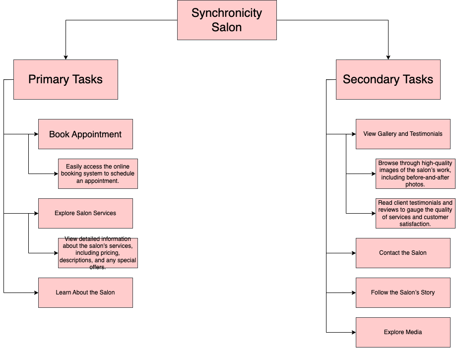
Concept Map

Logo
Logo
As a new business, Synchronicity Salon was still working on their branding. The first step for the redesign was creating a logo not only for the website, but also for the space. We held a contest on freelancer and together with the owner we chose this logo because not only it was the one that we found the most attractive, but the owner also felt was the one that complimented the salons aesthetic the most. Furthermore the big S and the small s represented the mother daughter duo that own the salon.
Initial Sketches

Home Page

Service Menu

About Us

Meet The Team
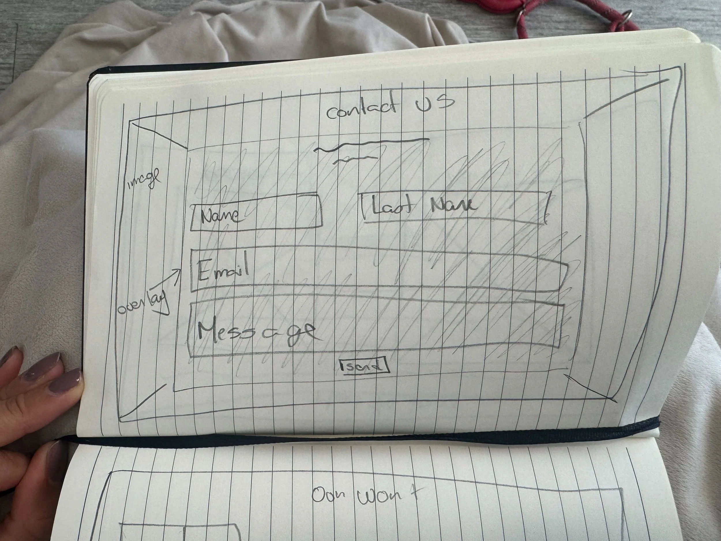
Contact Us

Our Work
After several meetings with the client, it was understood that they wanted minimum amount of subpages for their website. The concept we agreed upon was a scrollable one page website that contain anchors so when the user presses the section they want to navigate to, they are scrolled down to that section, that way the user has the option of scrolling down manually or just jumping to where they want to go.
High-Fidelity Wireframes
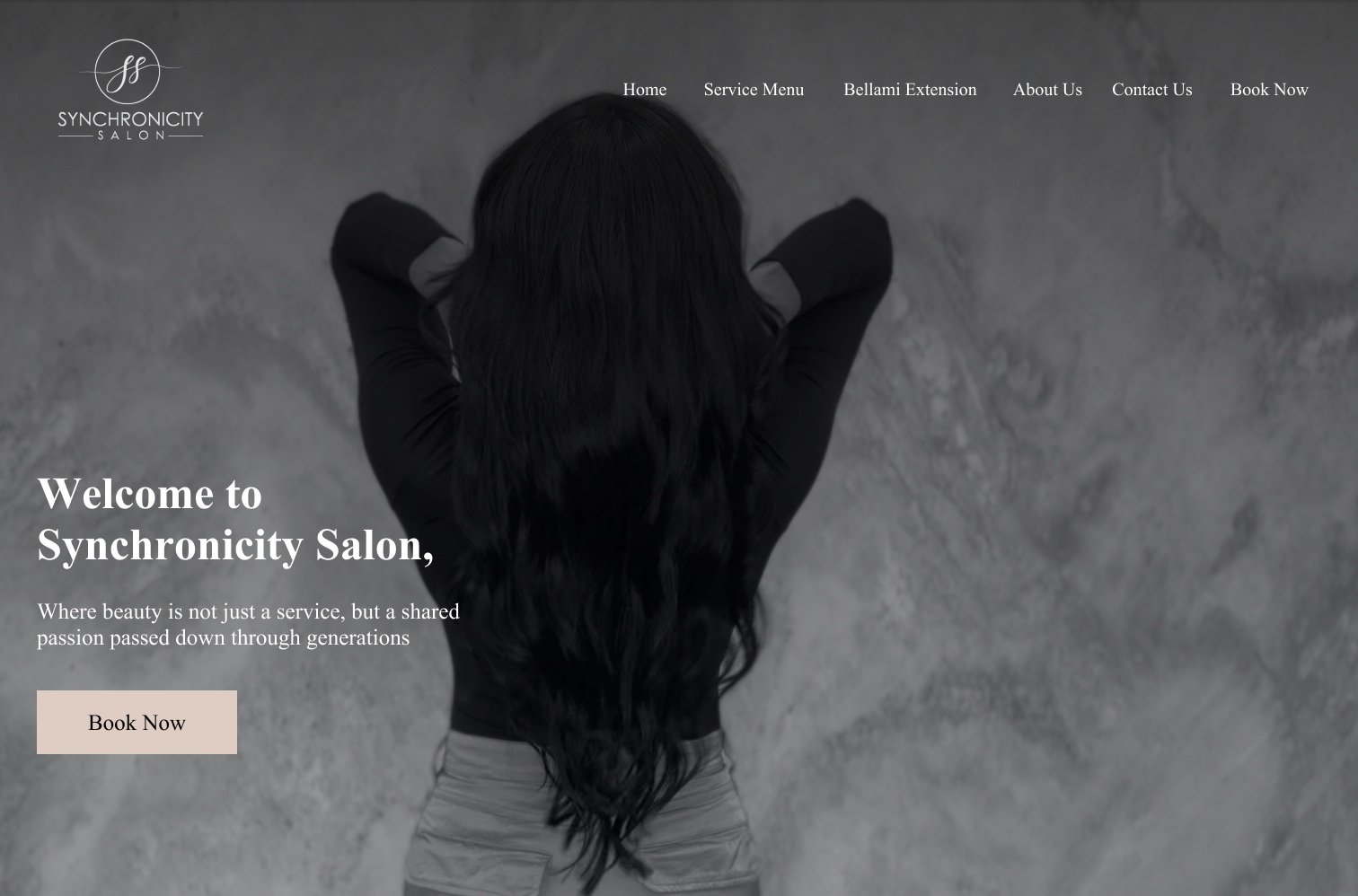
Home Screen

Service Menu Pt.1

Service Menu Pt.2

About Us Screen

Meet The Team Screen

Contact Us Screen
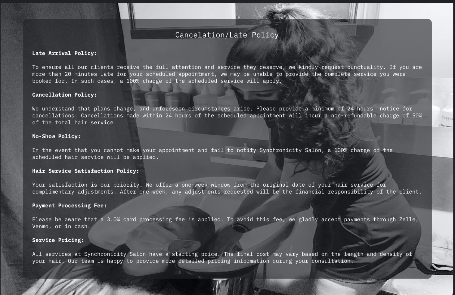
Cancelation Policy Screen

Our Work Screen

Bio Screen
After the client approved of the initial set of sketches I went and created a mock up of the website on figma, along with the subpages. Once the client approved of the mock ups, I went into the next step of the design process and started creating the website using squarespace.
SquareSpace Website
I used the CMS called Squarespace in order to create the new website. Considering the constraints that square space places it made it difficult to make the new website look exactly like the design pitched. However, after consulting with the client they where happy with the square space modifications. There where a few issues with functionality not working as expected due to constraints of the CMS used.

Website
Because Square Space had constraints with the functionality, I decided to try to use JS, HTML and CSS to create the website from scratch. As this is my first project of this magnitude, it is still on going as I am learning while creating the website.
*Ongoing

Reflection
Redesigning Synchronicity Salon’s website was an insightful and rewarding experience that brought together aesthetics, usability, and narrative to create a cohesive and engaging digital presence. It allowed me to explore how thoughtful design can bridge the gap between a brand’s physical atmosphere and its online identity.
Challenges Faced
One of the primary challenges was translating the salon’s unique in-person atmosphere—defined by warmth, style, and personality—into a cohesive online presence. The original website was cluttered, lacked visual hierarchy, and didn’t align with the brand’s aesthetic, making it difficult to communicate the salon’s identity. Working within the constraints of Squarespace presented additional obstacles, especially when trying to implement customized interactions or layouts. Designing a responsive interface also proved to be a learning curve, as my developing coding abilities required extra time and experimentation to achieve consistency across devices. These limitations demanded careful design compromises and creative problem-solving, particularly during the development of the scrollable one-page structure and the refinement of call-to-action clarity.
Successes Achieved
The redesign successfully transformed the salon’s digital experience, aligning it with its brand values and visual style. Clear calls to action, intuitive navigation, and a cleaner, more spacious layout helped create a more inviting user experience. Collaborating with the client to refine content and structure allowed for a more authentic representation of their story, while implementing a strong visual identity—including a new logo—gave the salon a more professional and polished online presence. Feedback from the salon owners was overwhelmingly positive, and the improved usability is expected to increase client bookings and engagement.
Areas of Improvement
While the project met its main goals, there is still room for refinement. Some design elements had to be simplified due to CMS limitations, and a fully custom-coded version is still in progress to overcome these restrictions. Continued growth in responsive design skills will further enhance consistency and performance across screen sizes. Future enhancements could also include expanded service filtering, improved mobile responsiveness, and integrations that support user convenience, such as embedded appointment scheduling or client reviews. Ongoing iteration and testing will ensure the website evolves in step with the salon’s growing brand and business needs.