


Peace Boat US
Role: UI/UX Designer
Skills: Wireframing, Prototyping
Timeline: 6 Weeks
“Peace Boat US fosters dialogue, cultural exchange, and activism to create a more peaceful and just world.”
Project Overview
This project involved a comprehensive redesign of the Peace Boat US website, a New York-based NGO dedicated to promoting peace, sustainability, and global education through global voyages and advocacy. The primary goal was to resolve key usability and navigation issues that made the current site frustrating and difficult to use. Through competitive research of similar mission-driven organizations, along with journey mapping and concept mapping techniques, the project focused on streamlining the user experience by improving site structure and reorganizing content. The outcome is a more intuitive and accessible digital platform that better supports Peace Boat US’s mission by allowing users to easily find information, engage with initiatives, and participate in global dialogue.
Problem Statement
For my Interactive Information Design class I was tasked to find a website that could use a redesign. During the entire semester I worked on a complete redesign of the Peace Boat US website. Peace Boat US in an organization I interned for during the fall of 2021. Through my work with them and the design process research I did I figured their main goal for the website was to get donations for the different programs the organization supports, and to inform people on the different programs the organization offers. Considering this I added several call to action button, which are missing from the original website to encourage user to take the actions the organization wanted.
Goals & Challenges
Goals
Reorganize the websites content
Optimize user experience
Improve the user interface
User Problems & Needs
Finding the content they want in a fast & efficient manner
Different fonts and sizes
Too much text, not enough visuals

Home Page Redesign
Design Process
Research & Discovery - Concept Development
Target Users
Gen Z: They mainly look to educate youth, and most of their programs are meant for people in between the ages of 17-22
Millennials: This group is mainly targeted as teachers and mentors. But mostly as donors. People with an already established business looking to partner.
Baby Boomers: Peace Boat target for baby boomers is mainly donations, partnerships and policy change activists with already established networks.
Original Website

Home Page
In the original website, there is a hero image. However, half of the image is covered by text with a white overlay that makes not only hard to see the image but also hard to read the text. Furthermore, the navigation is a bit overwhelming, as it has too many elements. There are also a lot of subpages with similar information, so finding where to go can also be challenging.

Updates
A lot of the design elements in the website are inconsistent. For example, the picture shows a set of cards to give users a snapshot of the “Latest Updates”. However, as we can see they are not uniform. Some of the cards have images others don’t. The spacing between the text is inconsistent, and the general sizing is also inconsistent.
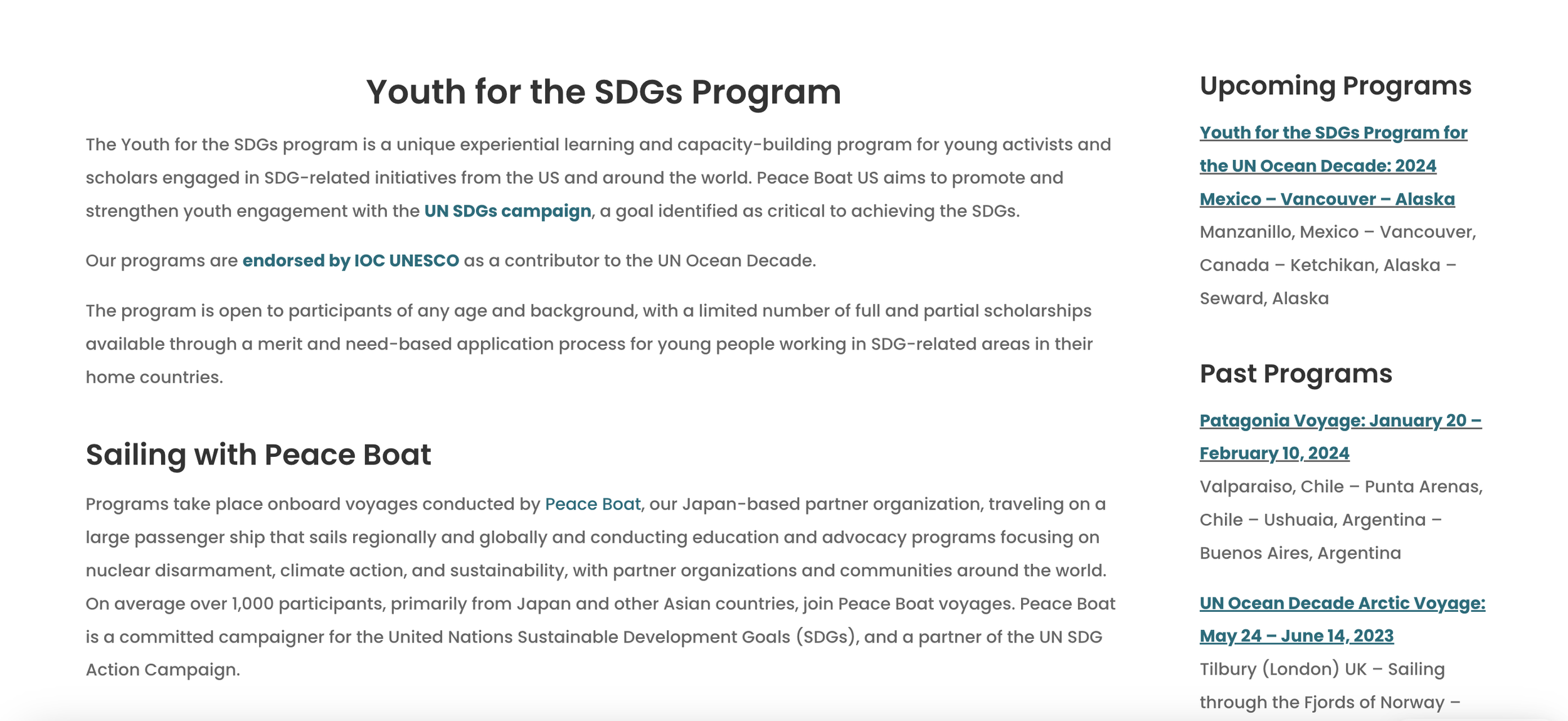
Youth For The SDGs Subpage
A lot of the subpages look like this. There is a lot of text and very few images. Looking at pages like this is not visually appealing to users and a little bit overwhelming. Furthermore there are two columns of text representing different types of information. The information could be displayed in a more graphic manner in order to catch users attention.

Donations Subpage
There is no consistency in the design choices. This is an example from the donation page, There are different areas of the company to donate for, so they give you a title a bit of an overview of what the donation would be used for, and finally a call to action button to ask users to donate. However, the placement of the “Donate” button is different in each instance.
Design Precedent

The ASPCA is a non profit organization dedicated to the prevention of animal cruelty in the United States. The ASPCA hold centers across the country and they are largely reliant on donations in order to operate. Keeping this in mind it makes perfect sense that their home page has two huge call to action buttons asking people for donations.

The WWF is an international NGO dedicated to the conservation and reduction of human impact on the environment. The WWF relies on volunteers, donations, grants and partnerships to fund their projects. Their home page menu is not very large and they had call to action buttons on the navigation to encourage users to donate or adopt.

Oceana is an international NGO that dedicates itself towards ocean conservation. Oceana focuses on achieving measurable outcomes to make tangible impact on marine ecosystems and the communities that depend on them. The website has a carousel that changes with images information and call to action buttons for the different initiatives. Furthermore, they also have a big and easily accessible donation button.

The Ocean Agency is another marine based NGO. They accomplish this through the use if innovative technologies, media communication strategies. This agency focuses on combining visual story telling, scientific research and technological innovation to prompt people to take action. You can see these principals in their website, which has a more modern look, with interesting animation that showcase pictures of the ocean and while navigating it makes the user feel as if they are going through a story.
Research & Discovery - Information Architecture & Wireframes
User Tasks

Concept Map

Desktop Wireframes

This is an image of my initial set of wireframes. I reorganizes the navigation, so it wouldn’t feel as cluttered. I also added several call to action buttons to incentivize users to perform the actions the company wants.
Mobile Wireframes

This is an image of my initial set of wireframes for the mobile version of the website. The original website did not have a hamburger menu which made the navigation overcomplicated. I also added several call to action buttons to incentivize users to perform the actions the company wants.
Peace Boat Web
This is an image of the final Mockups of the web redesign I did for the Peace Boat US website. For a closer inspection click on the link bellow for access to the Figma Files

Mobile Design
This is an image of the final Mockups of the mobile version of the website redesign I did for the Peace Boat US website. For a closer inspection click on the link bellow for access to the Figma Files

Style Guide

In order for the new website to be cohesive, I created a style guide containing the two fonts used in the website along with the text hierarchy paired with font and font size. The style guide also contains the color pallet and a component of the main button style.
Because Peace Boat US is an already stablished company with a clear brand, I decided it was best to stick with their already existing color pallet. I only added a bright orange color to add contrast to the call to action buttons.
Reflection
As the design process is concluded and a final project was submitted, there are still areas that can see improvement, as well as areas the could be reflected on. I would like to take a moment to reflect on the journey I undertook and the lessons I learned along the way.
Challenges Faced
Getting Images: One of the main objectives of the redesign was to include more images and visual elements to the website. However, considering that this was a class project and not one for the client, finding images to work with was challenging as there was not much material available.
Restructuring The Information Displayed: The original website was very text heavy. So, restructuring the information to display images and condense the amount of text proved to be a challenge.
Maintaining The Brand: Again considering this was a class project and not work for the client, maintaining the brand identity was also challenging, because I received no material on logo, branding colors etc.. I had to wing them and try to do them myself, while still trying to keep faithful to the original.
Success Achieved
Making The Website More Visually Appealing: By incorporating more images, the website became more visually appealing and less text heavy than the original. Furthermore, potential users can see the impact of the different programs through photographs and image sliders.
Including More CTA’s: The original website did not include intuitive and obvious call to action buttons. For the redesign I included a big orange donate button in the home page as well as keeping the donations subpage as part of the navigation menu.
Maintaining The Brand: Even though I had to play a little with the color scheme, like including the orange accent color, I feel that the colors still maintain the original brand identyty and the user would still feel that they are navigating the Peace Boat US website.
Areas of Improvement
The main area of improvement for this project would be the navigation. I would completely restructure it so it makes more sense. Furthermore, I would take out the “Donation” page from the drop down menu and included in the main menu, like other NGO websites do in order to make it easy to the user to access it.