

Optic: Vision For Accountability
Role: UI/UX Designer & Research
Skills: Wireframing, Prototyping, & Conducting Reasearch
Timeline: 6 Weeks
Collaborator: Mehdi Shah
Project Overview
Optic is a next-generation body-worn camera system designed to support front-line workers with a seamless, integrated experience across physical and digital platforms. Developed with a companion Android-based mobile app, Optic enhances field usability by combining real-time video, audio, and image capture with intuitive file management tools. Officers can sort, tag, and attach media to cases as they work, optimizing their workflow and improving data accuracy. With a 3.2” touchscreen display and key physical controls—including programmable buttons, a video recording slider, and a PTT button—Optic balances robust functionality with ease of use. This system redefines how body-worn cameras support accountability, safety, and efficiency in the field.
Problem Statement
Currently Body Worn Cameras (BWC) face many challenges such as limited field of views, short battery life spans, faulty buttons, not user friendly designs as well as issues with the storage of data. In order to improve usability and reliability of such devices will ensure that law enforcement officers have better tools in order to increase their accountability to the public.
Goals & Challenges
Goals
A Clean & Usable UI
User Friendly & Intuitive Design
A Seamless Navigation Across Physical & Mobile Platforms
Challenges
Designing For A Smaller Screen Size
Designing For Android OS
Taking Into Account The Physical Controllers

Optic Interface
Project Collaboration Note
This project was a collaborative effort between two dedicated design teams working in parallel to create a unified experience across both hardware and software. Our team was responsible for designing the interface and physical interactions for the body-worn camera (BWC), while the companion team focused on the mobile app experience. Although we worked on separate platforms, it was imperative that both products felt visually and functionally cohesive. To ensure consistency, both teams maintained close communication throughout the process—aligning on visual language, interaction patterns, and user workflows—so that the final product would deliver a seamless and intuitive experience for front-line workers across devices.
Design Process
Research & Discovery - Concept Development
Target Users
Police Officers
First Responders
Highway Patrol
Corrections Officers
Frontlines
User Problems & User Needs
Small Screen
Quick Access To Important Features Such As Video Recording & Emergency Button
File Sorting & Management
Data Back Up & Integrity


Imagery
Online Research
Police body worn cameras are currently mandatory for federal agents to wear. However, different states have different policies when it comes to the use of BWC by police officers. While some states enforce the use of BWC by all uniformed officers, other enforce it to specialize units like K9 units, gang violence etc. States also enforce the use of BWC depending on the situation. Most states for example demand officers wear BWCs when conducting planned arrests or warrants.
The use of BWC’s was implemented by the Obama administration, which instituted several grants worth millions of dollars in order to invest in BWC for police departments. Since then the use of BWC has steadily increased throughout the years. However legislatively and publicly BWCs have presented several issues.
The main reason why BWC’s where enforced was to hold police officers accountable and to reduce the unnecessary use of force by officers on civilians. This is the argument that holds the most when advocating for BWCs. However, different papers and different research shows contradicting evidence towards this. Many jurisdictions claim to have a significant reduction in violent police incidents against civilians since the BWCs have been implemented. While others haven’t. Or there have been issues where some police officers are wearing them and others have not.
Another big issue BWCs have brought comes to cost. Even though there are federal grants to help bureaus with the costs, they are still a very costly program worth millions of dollars a year. The issue is not only buying the cameras, but the costs of maintaining them, hiring people to review the footage and buying the tech to support the recorded footage. Smaller jurisdictions have problems covering this costs.
Another big issue is the reliability of the BWCs. Their battery life might not last, there might be faults with the buttons to turn on the camera, ad in some instances the devices have caught on fire while the officers are wearing them causing injuries.
However the biggest issue seems to lie on the privacy concerns of the general public. People do not necessarily want to be recorded. And even though some states demand that the officers inform them that they are using a recording device, this is not the case for all the states that use BWC. Furthermore people that are against the BWC argue that the footage can be used for facial recognition and further increase the issues of racial discrimination.
Considering this is a new technology, new improvements on the devices as well as the law are being made. And despite the controversies BWCs do seem to be helping. Not only by reducing violence of police officers against civilians, but also in aiding police officers with evidence when falsely accused of improper behavior during the job. BWC’s have also proven great when it comes to domestic violence cases as they provide evidence of the incidents once police officers show up at the scene.
Design Precedent
Body worn cameras have certain precedent design standards in order to ensure their effectiveness and reliability, as well as to comply with the ethical standards of using such devices.
One of the main design requirements and precedents for BWCs is about durability. Currently police officers' body worn cameras are made out of durable materials such as reinforced plastic or metal. This is done because the cameras are meant to be worn in dangerous scenarios where durability is necessary. The devices need to also be waterproof, dust proof and do well against impact. One of the most important aspects for the cameras is that they need to be small and light in order to not interfere with the officers duties, or hinder them in any way.
Another big standard has to do with the video and audio quality. BWCs need to capture video in high resolution with clear and detailed footage. As well as a good frame rate for a good video playback. The devices also need to have a wide frame of view lens in order to capture the surroundings in the best way possible. The devices also need to be able to adequately capture audio. Many devices also support night vision on their cameras.
Battery life is also a very important detail to hold into account for BWCs, as their battery should be able to last the entirety of a shift, so around 8-12 hours. The devices should also have a quick and easy way to replace the battery. Most devices use USB or charging docks in order to recharge them.
Devices also need to have good storage capacity to retain recordings made before the recordings can be uploaded somewhere else. As well as options for automatic and manual offloading of the data and backups of it. With storage also come the security standards. The encryption and secure storage of BWCs are extremely important, as they need to protect the privacy and integrity of the data to prevent tampering. There should also be access controls in order to ensure only authorized people are able to access the data within the cameras.
BWCs need to have easy and quick activation mechanisms to capture and record events in an efficient manner. They should also allow for quick integration with other law enforcement equipment. The user interface of the devices is also extremely important as it should be intuitive and user friendly as well as not overly complicated. BWC need to have clear indicators of recording being active in order to make both the officers and other people around them aware of the fact that they are being recorded.
User Interviews
Our Team interviewed a former police officer on his experience using body worn cameras. His feedback helped our team have better understanding of a first responders workflow using BWCs.
Main Considerations
Using markings to identify important moments
Importance of labeling

Interview Notes
Research & Discovery - Information Architecture & Wireframes
User Tasks

Concept Map

Sketches

Video Preview & Pairing Sketches

Settings Flow Sketches

Video Repository Sketches

Case File Flow Sketches

Recording Sketches

Video Tagging Sketches
Wireframes With Annotations


User Testing & Findings
Method
The way we conducted our evaluations was with an informal session where 3 participants were randomly assigned to demo our prototype for about 10-15 minutes as they both gave feedback verbally and later filling out a feedback capture grid form to help facilitate thought about our prototype and how we can improve on it later. The feedback capture grid is a commonly used form of feedback for prototype evaluations like this as it gives certain key feedback points that are especially important for establishing where we must go with the revisions our prototype will have in the next stage. All while our team was moderating the 20 minute sessions, there were open opportunities and communication between the participants and moderators asking questions about the thoughts our participants were having during the session.
Main Takeaways
Two “Go Back” buttons are unnecessary
The “Folder” section organization is great
Change the wording for notification in the settings page
Emergency should not be a tab on the top menu
File and folder should be the same
Make it clear how to back up data
Only have one button in the bottom navigation
Include start recording and stop recording ques

Imagery
Modifications Based on Testing

Home Page/ Log In Flow
The first impression of any application or website is one of the most important aspects to design, While generally the flow was commented on as being very well done, there was still issues when it came to properly branding the physical prototype so it matched with the companion app.
In order to fix this issue, we decided to add a splash page to the log in flow. So now when the device is turned on, the splash face appears for a couple of seconds and then the log in page is opened.

Homepage
There is now a very apparent emergency icon added to our Home Screen (moved from the top navigation bar). This was suggested by participants, they mentioned that the feel emergency should be more easily accessible, but it’s not important enough to be on the top menu.
Visually the whole layout of our prototype has been shifted and made more sleek, while there wasn’t any general complaints about how our color scheme was done we elected to keep the visual style simpler by removing the gradient.
The three buttons on the bottom navigation bar in the original was a pain point that was pointed out by 2 of our 3 participants. They suggested just one home button. As a team we made the decision to make the home button the logo to improve branding.
4. In the before prototype for this section, there was three functional buttons that took to three tasks -but it seems many of our users saw this as a status bar - indicating that there should be different percentages around the system. So we ran with that and decided to add many important statistics that were only found in the settings before.
5. Because of the aforementioned emergency and notification switch up in the top bar and top navigation, these icons had to be swapped around and replaced completely. So we put some of the missing functions that our users found would be more useful to have quick access to like picture capture and audio recording.

Media Tab
A suggestion from participants was specifically around the type of icons and types of media that was accessible between the media tab and the folder tab. And because we had zero voice recording functions on the homepage - there was questions around where audio files would appear, since thats also paramount media to access for our uses. So it was elected to add some audio functionality to the media tab to give more clear indications of what we intend for this tab.
Participants also had issues with some of the line/text spacing throughout our original prototype, this was primarily talked about in the Media tab section. So we easily fixed this issue by lowering the text only by a little bit and making it much more comfortable to look at and interactive with.

Meta Tags
During their first run through of the original prototype participants mentioned that the meta tags were too confusing with how it is all laid out. We all agreed that the original way never conveyed that they were ‘playlists’ to put the videos into, so now we turned them into a selectable interface that should be more appealing and understandable.
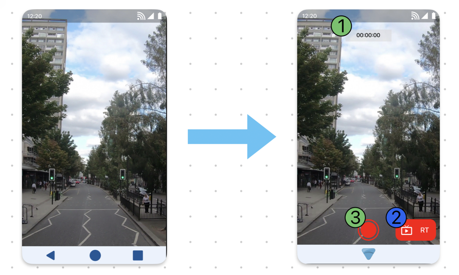
Recording Screen
Our original recording screen had a lot of information having to be inferred, and this seemed like a pain point from the participants. They mentioned giving it more smartphone aesthetics would make it more intuitive. So we added a timer to indicate that the recording started visually.
The realtime broadcast was not completely finished in the original prototype, so it was not accessible for our participants for the prepared user flow. So we added these function to start the realtime broadcast.
Participants also mentioned that there was no button to start the action of recording. So we simply added a clickable button to indicate it.
Optic
Prototype Video - Turn On Flow
This is a video of the final Prototype of the application. This video represents the flow if a user is just turning on the device and logging back in. For closer inspection of all the design boards, click on the link bellow for access to the Figma Files
Prototype Video - Hardware
This is a video of the final Prototype of the application. This video represents the flow of the hardware functionalities of the prototype. For closer inspection of all the design boards, click on the link bellow for access to the Figma Files
Style Guide & Branding
Style Guide

Style Guide
In order for both the physical prototype and the mobile companion to feel cohesive when two different teams where working on each, we created a detailed style guide, with the colors to be used, the font and the iconography to be used throughout the app
Branding
In order for both the physical prototype and the mobile companion to feel cohesive our team came up with also adding branding imagery to the style guide, so both products would hold a similar aesthetic.
Furthermore, we also decided to incorporate some of these images within the flow to further strengthen the branding.

Branding Imagery
Reflection
As the design process is concluded and a final prototype was submitted, there are still areas that can see improvement, as well as areas the could be reflected on. I would like to take a moment to reflect on the journey we undertook and the lessons learned along the way.
Challenges Faced
UI Complexities: One of the main challenges we faced was creating a user friendly interface that did not create an overwhelming experience for our users with too many features, and an overly complicated user flow. We wanted to properly manage simplicity and functionality in order to provide the best experience. The round of user testing we performed provided invaluable feedback.
Data Security & Privacy: One of the main goals for the project was ensuring data security and integrity. We had to integrate strict access control to protect the data from unauthorized access to the BWC device as well as disabling the possibility of deleting data permanently.
Integration With Companion App: The broader project consisted not only of a wearable device, but also a companion app. Seeing as two separate teams where working on different areas, one of the main challenges was implementing similar styles to communicate uniformity and brand consistency to our users.
Successes Achieved
Intuitive User Experience: Despite the complexities of the project, and having to work with a smaller than usual screen and physical controllers, we managed to create a simple and intuitive user experience. We aimed to create an experience that would significantly minimize the learning curve of using the device. We created a simple navigation with clear user flow paths.
Feature Sets: Even with the simple design, we manage to incorporate a wide range of features, such as real time broadcasting, walkie talkie, pre buffering, emergency calls, programmable buttons to enable quick actions customizable to the user. We also included file management, storage, battery and signal indicators. We also added security protocols to properly synch the device to a companion app.
Following Industry Standards: Based on our research and the guidelines provided to us at the beginning of the project, we carefully followed industry standards in regards to screen size, target size, spacing and text size. We also implemented physical notifications so both officers and civilians can be aware of when being recorded. Furthermore all the actions supported by the physical controllers are also controllable through the touch screen.
Areas of Improvement
Better Performance: In order to better optimize improvement, another round of user testing would have been very useful. Another round of testing would be best with more users in order to get more feedback on the product.
Better Integration Between Companion App & Physical Device: With a bit more time to work on the project, we could have implemented a better integration between the companion app and the physical product.